Yesterday I posted about the changes to Facebook’s Cover Text rules. Today I will be talking about more changes in the next few weeks. Seems like we just got used to the new timeline and now it is going to change again! I’m not complaining. I like change and I especially like some of the changes I have heard are coming our way in the very near future.
You know how when you look at your timeline and you have to switch back and forth between the two columns to read your posts in order….this will be a thing of the past. You will have a single column timeline….YEA!!!!
A few people already have this change and my guess is after Tuesday’s press conference, Facebook will begin the rollout.
Other new features include going back to a tabbed design and the ability to organize and hide sections of your profile. Also old sections that we haven’t seen in a while are returning. They include “Books” and “Notes.”
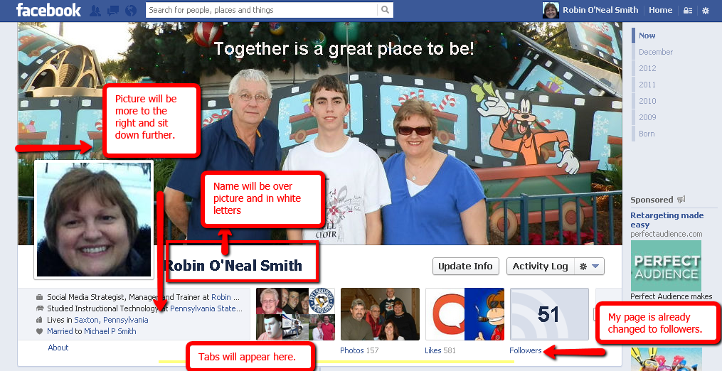
If your cover image did not need a makeover because of the 20% text rule, you may need one with the profile cover change coming our way. The cover is still the same size, but the profile picture is moved further to the right and sits lower in the cover picture. It also has your name in white OVER the cover image.
If you have subscriptions turned on, your subscribers will now be known as followers, which seems to make sense. This change has already occurred on my page. See the picture below.
You can learn more details and see pictures of the new timeline on Mari Smith’s page.
I honestly like most of these changes. Currently they are only for your personal profile, but I’m sure it is just a matter of time till they are moved to the business pages, so get prepared. I’m anxiously awaiting Tuesday’s Press Meeting to learn more.
Let me know what you think of the proposed changes in the comments below.


